Let's Create a Diverging Bar Chart
We start this tutorial by creating a diverging bar chart (Figure 1) using Mascot. This chart visualizes a hypothetical dataset reporting people’s opinions on a subject matter, broken down by age (below 30, 30 - 50, 50 - 70, above 70) and responses (strongly agree, agree, disagree, strongly disagree). You can see a demo of this visualization on the gallery page.
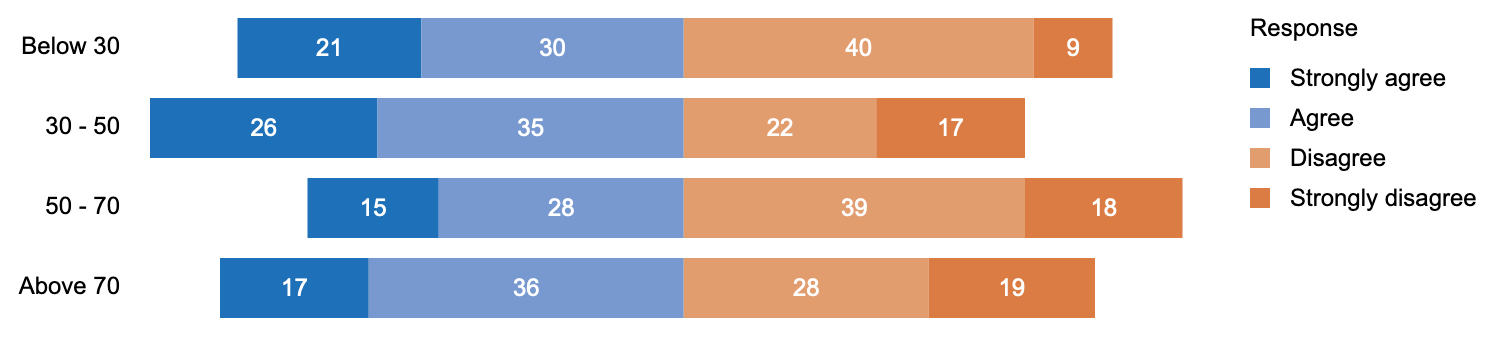
Figure 1: Diverging Bar Chart
Figure 2 shows the dataset “survey_response.csv” behind this visualization. The data table consists of three columns: Age Group, Response, and Percentage (percentage of people with a particular response within an age group).
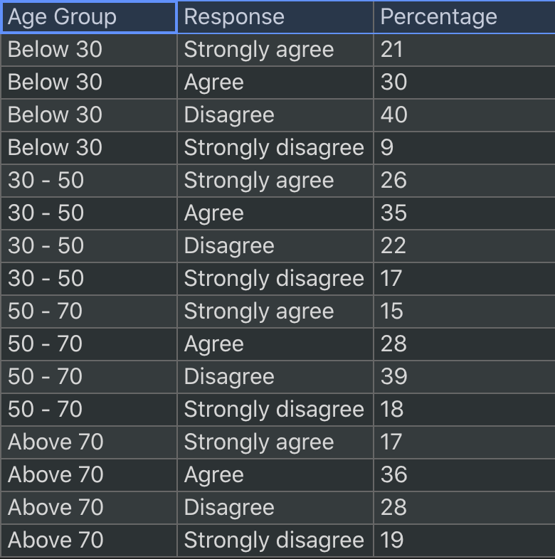
Figure 2: survey_response.csv
Initialize Scene and Import Data
To begin, we create a scene, which represents a top-level container, and import the data:
let scn = msc.scene();
let table = await msc.csv("survey_response.csv");
IMPORTANT: Note that to declare the table object, you need to put the above line of code and any other code that handles the table object in an asynchronous function, or use the Promise.then() method to handle the table object. For more information, see here.
Next, let’s create a rectangle in the scene and specify its properties:
let rect = scn.mark("rect", {
  top: 100,
  left: 200,
  width: 700,
  height: 30,
  strokeWidth: 0,
  fillColor: "#ddd",
});
Now we can’t see the rectangle yet, as it has not been rendered. If you do console.log(rect), you will be able to see the rect object in the console. To display it, let’s add a line to create a renderer:
msc.renderer("svg", "svgEle").render(scn);
Here we are creating a renderer that renders the scene to an SVG element with the DOM ID “svgEle”. We can see the gray rectangle now:

Join Graphics with Data and Lay out Marks
Next, we want to have multiple rectangles, each representing an age group. This is done by using the repeat operation:
let collection = msc.repeat(rect, table, {attribute: "Age Group"});
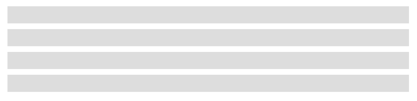
This will give us a collection of four rectangles, each representing an age group in the dataset. By default, the repeated rectangles will have the same properties (including position) as the original rectangle. To space them out, we can apply a grid layout with only 1 column and a vertical gap of 10 pixels between the rows:
collection.layout = msc.layout("grid", {numCols: 1, rowGap: 10});
This gives us the following visualization:
Next, we want to further break down each age group by responses. We can use the divide operation:
let {newMark, collection: bars} = msc.divide(rect, table, {attribute: "Response", orientation: "horizontal"});
which gives us the following visualization:
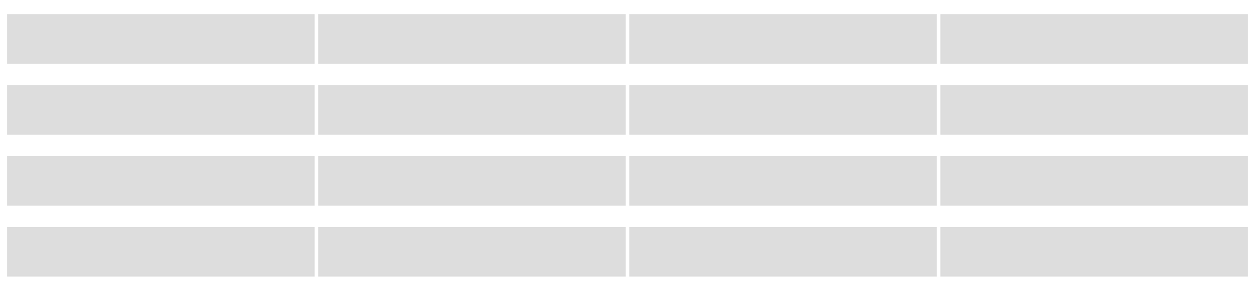
When using the divide operation, we do not need to pass all four rectangles as arguments; we only need to pass one rectangle, rect, as an example. Mascot will find all the “peers” of rect and perform the divide operation on all of them. The divide operation returns two visual elements as a result of dividing rect: a new bar (newMark) serving as an example of the new marks created, and a collection of new bars (bars).
Specify Visual Encodings
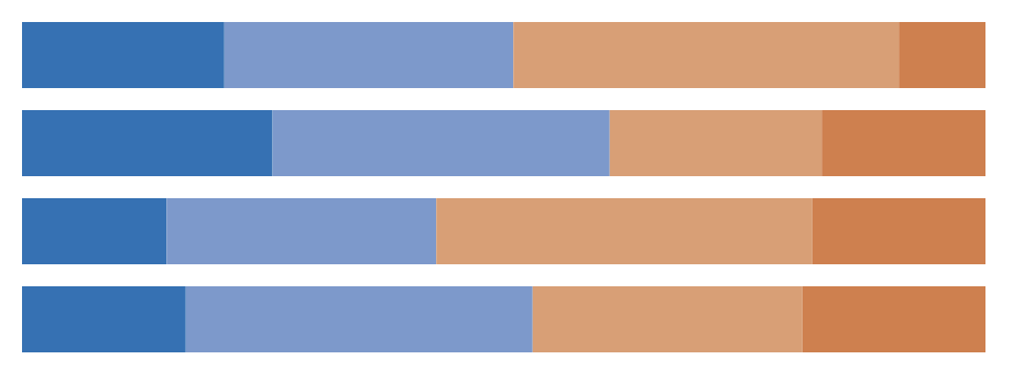
Now we can map data attributes to visual channels. First, let’s map “Percentage” to the width of the rectangles. We need to pass the new bar mark as an example to the encode method:
scn.encode(newMark, {attribute: "Percentage", channel:"width"});
And we can map “Response” to the fill color with a self-defined mapping:
let colorMapping = {"Strongly agree": "#1e71b8", "Agree": "#7799cf", "Disagree": "#e29d6f",
                    "Strongly disagree": "#da7c43"};
scn.encode(newMark, {attribute: "Response", channel: "fillColor", mapping: colorMapping});
Here’s what we have after applying these encodings:
Apply Constraints
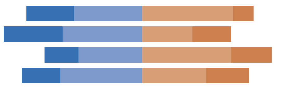
We want to align these bars to clearly show the divergence of opinions. To do so, we find all the light blue bars representing the response “Agree”, and align them to the right:
let agreeBars = msc.findElements(scn, [{attribute: "Response", value: "Agree"}]);
msc.align(agreeBars, "x", "right");
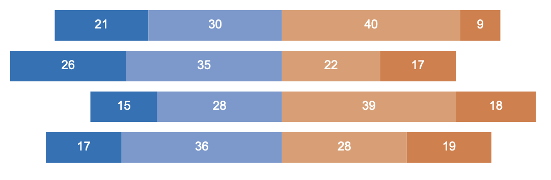
We can then create some text marks and affix them at the center of the rectangles:
let text = scn.mark("text", {fillColor: "white"});
msc.repeat(text, table);
scn.encode(text, {attribute: "Percentage", channel: "text"});
msc.affix(text, newMark, "x");
msc.affix(text, newMark, "y");
Create Axis and Legend
Finally, let’s add a legend and an axis (labels only):
scn.legend("fillColor", "Response", { x: 800, y: 100 });
scn.axis("y", "Age Group", {
  orientation: "left",
  titleVisible: false,
  pathVisible: false,
  tickVisible: false,
});
Voila! We have the visualization in Figure 1.