4. Join Graphics with Data
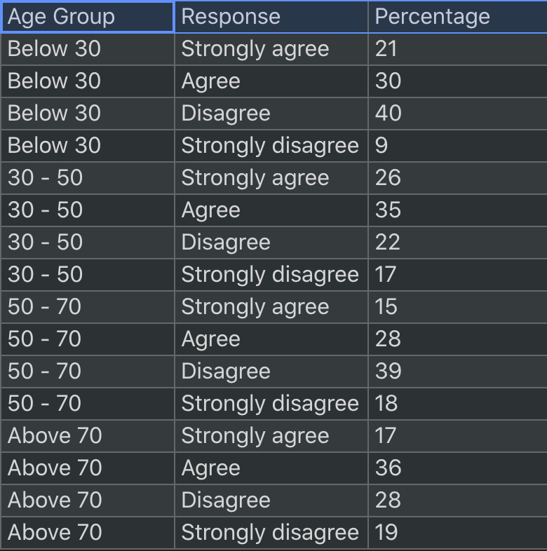
Mascot offers three primary operations to generate marks or glyphs by data: repeat, divide, and densify. To explain how these operations work, let’s use the dataset in the diverging bar chart example. The data table consists of three columns: Age Group, Response, and Percentage (percentage of people with a particular response within an age group):
repeat
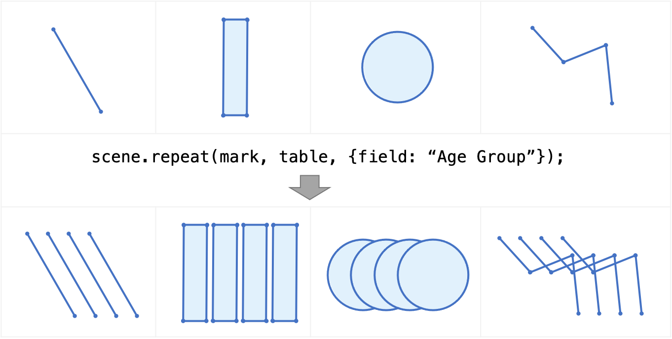
The repeat operation applies to a mark, glyph, or collection, and replaces it with a collection of repeated elements. Each element in the collection represents a unique value in the optional attribute parameter. In the figure below, we repeat a mark by the attribute “Age Group”. There are four unique values in the attribute “Age Group”, so we get a collection of four marks. If the attribute parameter is unspecified, a mark or glyph is created for every item (row) in the data table. The generated marks are peers of each other. They have the same visual properties, including position and size, so these marks will overlap. The figure below is meant to show clearly the number of marks generated. It does not accurately reflect the positions of the generated marks.
All the items with the same attribute value are joined with each corresponding mark as its data scope. For example, the data scope of the first mark in the generated collection is the first four rows with “Age Group” equal to “Below 30”.
divide
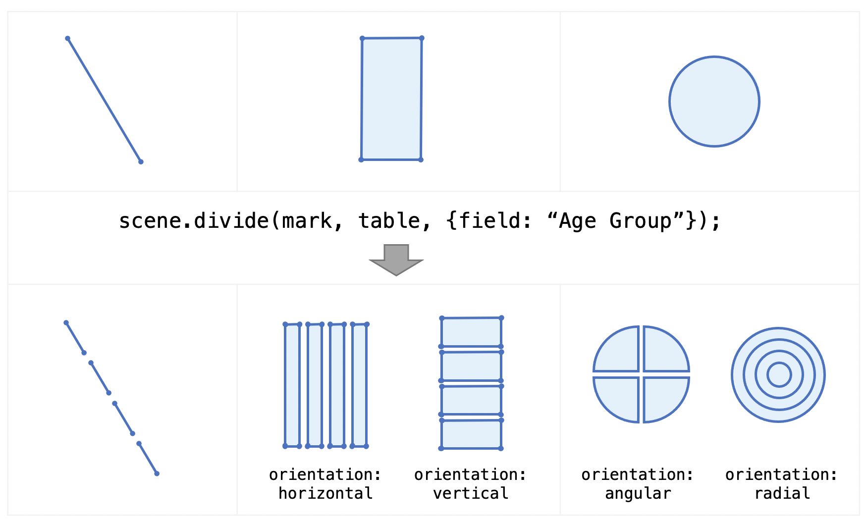
The divide operation splits a data-bound mark into a collection of smaller marks. These generated marks are peers of each other. The output depends on the mark type and the orientation parameter, as shown in the figure below. For example, dividing a circle or ring along the angular orientation produces arc-like slices, while dividing a rect or area along the horizontal or vertical orientation produces stacked sub-marks. The graphics-data joining mechanism is similar to that of the repeat operation: items sharing the same attribute value are assigned as the data scope of each corresponding mark in the output collection.
densify
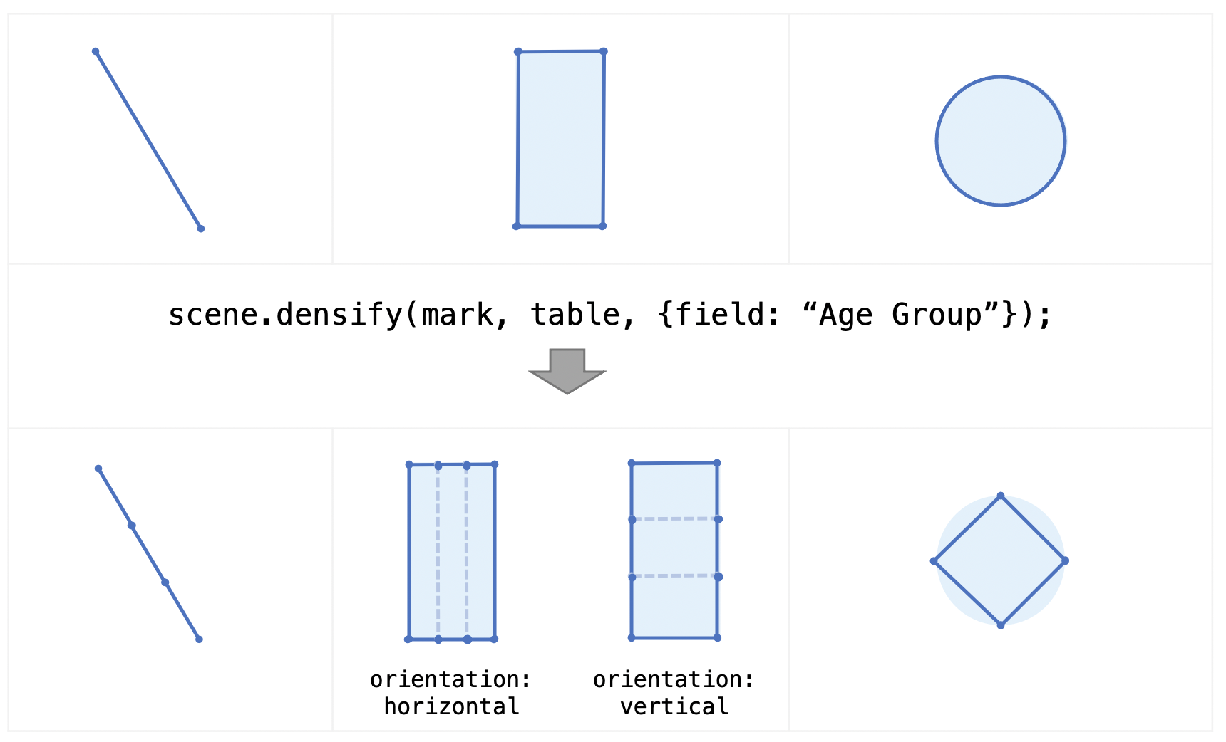
The densify operation adds vertices along the border of a mark, and replaces curve segments with line segments. A line, for example, is replaced by a path; a rect is replaced by an area mark, and a circle is replaced by a polygon. The generated vertices are peers of each other. The graphics-data joining mechanism is similar to that of the repeat and divide operations. Each vertex has a data scope that represents a unique value in the attribute parameter. The number of vertices in the output path and polygon marks is equal to the number of unique attribute values; the number of vertices in the output area mark is twice the number of unique attribute values, as both parallel sides of a rect are densified.
All three operations are available as standalone functions. The API reference contains details about the parameters.
concatenate operations
These three operations can be concatenated to create more complex structures. In the diverging bar chart example, we applied repeat first, then divide, which gave us a stacked bar chart. When we apply repeat + densify to a line, we can create visualizations such as sparklines or multi-line graphs. We can also apply repeat multiple times and get nested collections, which are common in small multiples. It is recommended that you apply repeat first before applying divide or densify.